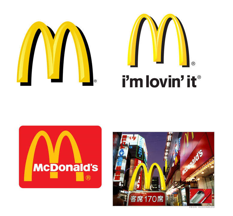
What’s in an Arch?
…McDonald’s Golden Arch of course! This familiar logo was designed in 1953 when Richard and Maurice McDonald built their first franchised outlet. It was originally used to symbolize the “M” for McDonald’s, but how little did we know that this simple Golden Arch would evolve into something much more.
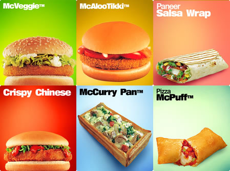
McDonald’s has opened franchises in 123 countries around the world. In these 123 franchises, they may serve different items on the menu. Take a look at India:
They may even have different Ronald McDonald figures. Take a look at Thailand:
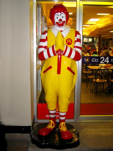
Again, this figure would only make sense in certain parts of the world. The food may change, the figures may change, even the portion sizes may change, but one thing will remain the same: the Golden Arches. That’s the power of a brand, of a logo, of a simple two looped symbol- it may be small, it may seem insignificant, but don’t underestimate its ability to reach and touch people all across world. I guess….that is what’s in an Arch.
Contributed by Tiffany Lan