When Unifying Brands, Simplicity and Consistency are Key
Today we are excited to have a guest blog from Senior Graphic Designer Dave Dixon!
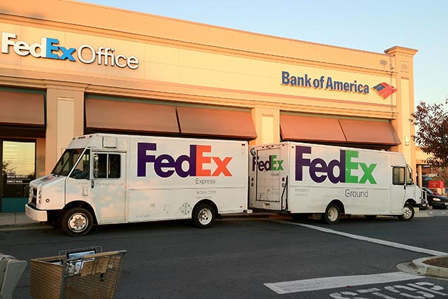
What’s the difference between FedEx, FedEx Ground, and FedEx Freight? FedEx themselves just placed a big bet on the answer actually being “who cares?”
For the last 15 years or so, part of FedEx’s brand identity has included separate sub-brand identities for each of its independently operated companies. These initially included designations including FedEx Express and FedEx Ground, and subsequently came to include several more sub-brands, such as FedEx Freight and FedEx Office. From a customer point of view, one of the most recognizable differentiations between these sub-brands was color – think purple and orange for Express, purple and green for Ground, or purple and red for Freight.
Last week, however, FedEx announced that they would be doing away with those sub-brands (and all the fun color combinations) and moving towards one unified FedEx brand and logo. Unsurprisingly, they’ve opted for the purple and orange mark, which matches the company’s original color scheme and which internal research showed to be the most widely recognized among consumers.
So what does this mean for branding in general, if it means anything at all? The primary takeaway, as has been the case in other examples we’ve highlighted, is that simplicity is key.
For certain brands, differentiating between several sub-brands is key. Think car companies, such as General Motors with Cadillac, Buick and Chevrolet, or Microsoft Office with Word, Excel and PowerPoint. These sub-brands communicate something important to the consumer, whether it’s price point, quality, or function.
Additionally, creating distinct and differentiated brands within a portfolio can allow for an organization to maximize its market presence, without the risk of over-saturation or confusing brand messaging.
So what about FedEx? As long as they deliver your package on time and in one piece, does it really matter whether it flew in on a plane or stuck to the highways? The answer appears to be no. That promise of “on time and in one piece” is consistent across sub-brands.
And if the message is the same, what’s the point in having it delivered via different brands? In this case, differentiation becomes unnecessary at best, confusing and overcomplicated at worst.
 This is a crucial part of this type of brand decision process. Consistent color schemes, logos or other visual brand elements aren’t enough to truly bring brand simplicity to life. These brands must, to the most they can be, align from the top down. Otherwise, consumers will see not consistent and strong branding, but confusing branding that doesn’t seem to know what it wants to be.
For FedEx, this alignment is also boosted by an iconic brand at the top. The purple and orange colors, along with the instantly recognizable logo, give the sub brands instant brand credibility. As far as brand portfolio alignment strategies go, FedEx has followed the gameplan as they should, with the hope that they can leverage the main brand as their portfolio grows.
As a graphic designer, and as someone who loves categorization and organization, I get it – selecting different colors for your brand identity is fun and can be difficult to resist. And in the right situation, it can be an effective way to communicate and elevate your brand. But before you jump head first into the pool of sub-brands, take a step back and evaluate: Do each of those sub-brands truly have something unique to say? As FedEx recently decided, the answer may very well be “no.”
Learn more about building your best brand portfolio strategy by downloading this FREE webinar, “Identifying The Opportunities In Your Brand Portfolio – Are You Capitalizing On Every Potential Business Opportunity Your Portfolio Provides?”