Oh The Places Your Logo Will Go: Unexpected Mediums that Must be Considered in Visual Branding
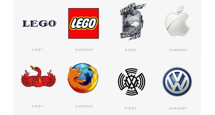
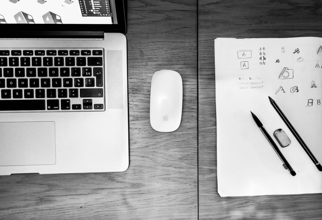
When working through the visual branding process, especially in logo design, there are a few obvious places the logo will need to be displayed, such as office signage, business cards and websites/social media platforms. But it’s not enough to simply perform in the usual logo locations – in today’s increasingly diverse mediums in which logos will be deployed, logos must perform as they are needed, no matter the new and unexpected places they might be found.
Continue Reading