Teaching an Old Dog New Tricks – Why Branding Isn’t Just for New Businesses
March 30, 2017
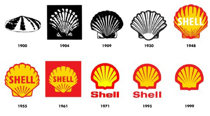
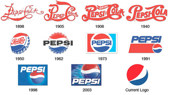
Just because you’re an older organization that came to fruition before strategic brand building was commonplace doesn’t mean you’ve missed the boat. If your brand needs a refresh or a restart, don’t feel as if the latest and greatest branding techniques are only left to the upstarts and newcomers. Let’s explore three reasons why branding is important for the established organizations in the business world.
Continue Reading