Can New Visual Branding Strategies Make McDonald’s a “Modern, Progressive Burger Company”?
Today we are excited to have a guest blog from Senior Graphic Designer Dave Dixon!
“Modern” and “progressive” may not be the first words you would associate with fast food titan McDonald’s, but company leadership is working to change that. Enter the latest packaging revamp, which will roll out during the course of 2016 and is intended to work hand-in-hand with restaurant design, digital marketing and other brand conduits to establish McDonald’s as “a modern, progressive burger company,” as CEO Steve Easterbrook described it.
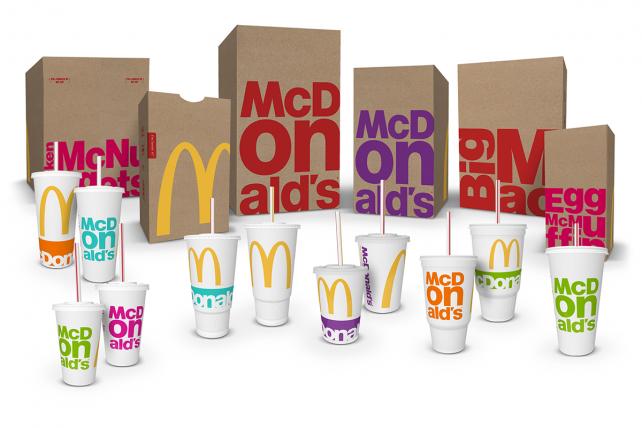
Specifically, the new packaging introduces a bright, vibrant secondary color palette to pair with the traditional red and gold so closely associated with McDonald’s, in addition to simplifying and de-cluttering the overall look of the various bags, cups and containers.
However, in tandem with the iconic golden arches, it’s the typography that really takes center stage in this design. Whether it’s the “McDonald’s” name or specific menu items (Big Mac, Egg McMuffin, Chicken McNuggets, etc.), type is the focal point of the design, using a bold font and stacked composition to noticeably break from previous packaging styles.
Time (and, perhaps more importantly, updates to the actual food on the menu) will tell whether this new packaging and visual branding strategy can achieve the stated goal of looking modern and progressive, but for me it misses the mark. While I can’t disagree that it’s more modern than the previous packaging, I also can’t shake the feeling that this is 2010’s idea of progressive, like your parents throwing their first Ugly Sweater Party this past December.
Feedback indicated that consumers “wanted McDonald’s to be McDonald’s,” according to Matt Biespiel, McDonald’s Senior Director of Global Brand Development, and the new packaging clearly reflects an attempt at balancing that with the push towards something more forward-thinking. Ultimately, that balance just isn’t quite right.
I love the oversize, bleeding-off-the-edge golden arches, and the iconic yellow is a vibrant contrast against the brown bags, but with both the traditional yellow and red present, the new secondary  palette clashes instead of complements. And the secondary color palette itself seems to be trying too hard, especially when you read the names McDonald’s has assigned to them ¬– Magical Magenta, Ocean Fresh Blue, Optimistic Orange, Passionate Purple, and Zesty Lime. Consumers will likely never hear those names, but they (unfortunately, in my opinion) do match up with the colors themselves.
The typography, which as I mentioned is the focal point of the new design, also leaves a lot to be desired. The stacked configurations could have been interesting, but by using the established, corporate font found in the McDonald’s logo, they never really had a chance of looking truly progressive. Product names also seem to adapt to this style more easily than the company name, where the “on” in “McDonald’s” is overpowering and distracting.
Perhaps a more limited color palette and a purposeful juxtaposition between the big, bold golden arches and a more restrained, refined type treatment on the opposite side would have been more effective. It’s certainly understandable that companies like McDonald’s need to capitalize on their existing brand equity, but there has to be a better way to carry out the specifics.
Perhaps the most interesting aspect of this redesign from an industry insider’s perspective is the process that led to the new designs. Rather than working with one specific agency, McDonald’s brought together a team that included designers from each of its seven lead agency partners from across the globe. The team had just a week to brainstorm, and after receiving mid-week consumer feedback, narrowed things down to three finalists.
It’s impossible to say how McDonald’s new packaging would have looked had it been designed by a single agency, but in this case, the result seems to reflect the unorthodox process used to create it. In isolation, certain elements might have worked, but the whole ends up seeming somewhat less than the sum of its parts. In fact, by trying to be everything to everyone, McDonald’s just may end up being nothing to anyone.
Addison Whitney is a global branding firm with a passion for building strong brands.
To learn more about Addison Whitney, visit our website at AddisonWhitney.com, or contact us here.