March Madness: When Even the Floor is Branded
This week, 68 teams from around the country will take the floor to battle for a national championship in the NCAA Men’s Basketball Tournament. “March Madness” as it’s known to millions of fans (some more casual than others), is one of the biggest sporting events in the country each year. And as any branding expert will tell you, that much attention brings an even bigger need for a strong branding production.
We’ve covered how the tournament can help the brand efforts of smaller schools who make a strong appearance, and the brand strength of the term “March Madness” is well-known, but the branding of this event literally and truly starts from the ground up.
The NCAA, although classified as a non-profit organization, knows the monetary value of all of those sets of eyes on their event from start to finish, with every game of the tournament broadcast on television and millions of brackets filled out, causing even more attention to be paid to even the earliest games.
They also know not to pass up a chance to brand every element of the tournament, from the “First Four” games where eight teams battle in Dayton, Ohio in what essentially count as play-in games to the main tournament, all the way to the NCAA logo sewn into every jersey of every player on every team participating.
What to learn more about how you can build your brand? Let’s talk.
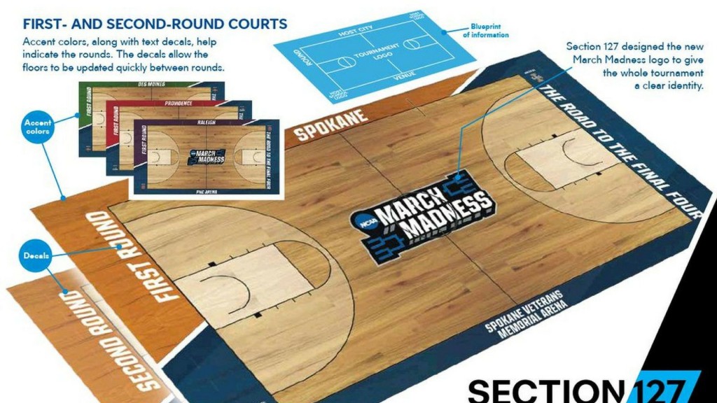
But there’s one branded element that may hold the title as the most watched and most overlooked branding of the entire event – the actual floors on which the games are played.
Yes, March Madness branding is so all-encompassing that even the very playing surfaces are incorporated into the overall brand profile and given a high level of attention to ensure they are both brand compliant but also provide their own unique addition to the visual branding.
The branding of the floor starts with at the middle, where each court is anchored by the logo of March Madness, stretching across almost from three-point-line to three-point-line and serving as the eye-catching visual branding element of the court.
Here’s a sneak peek at what the #MarchMadness courts will look like this year! pic.twitter.com/CxAIAs4ALL
— NCAA March Madness (@marchmadness) March 2, 2017
Then, along the edge of the court, along the one baseline and both sidelines, the basic information is provided – where the game is being played, what round it is, and who is the host team/conference. The tournament tagline, “The Road to the Final Four” stretches across the other baseline, joining the halfcourt logo as the consistent brand aspect across each location.
Now, some have clamored for the return to the old way of doing things, where the floor of each venue stayed the same as it was the entire season for whomever played there, providing a kaleidoscope of colors, logos, designs and wood finishes whenever you switched from game to game. The only sign that you were watching a Tournament game was the NCAA logo decal placed somewhere on the court.
While it may have made things more visually interesting, the NCAA knew that it was the very opposite of what they needed to do to strengthen the brand. March Madness is one of their most prized events, one that brings in enough money and attention to drive the majority of the association’s work. And when you have an asset this strong, you do everything you can to tie it back to you.
Today, with the similar-but-not-identical designs and the focus on key elements of the overall March Madness and NCAA brands at the forefront, each court serves its purpose as both informational and branded – oh yea, it also is counted on to host the actual games.