When Less is More in Logo Design and Visual Branding
As brands and logos have evolved over the last several years, it’s become evident that simplicity and minimalistic design is a key new direction for modern brand marketing. Even the most iconic brands and logos are following the mindset of “less is more” when it comes to their designs. From less detailed images to geometrically-inspired outlines, brands are embracing a clutter less existence.
One of the most prominent features of this trend involves tweaking, or in some cases, totally removing, the typographic element of the logo. In a recent article, author Kalle Oskari Mattila examined this shift, highlighted by MasterCard’s recent rebranding, in which their new logo was de-emphasized with the state goal to do away with the text altogether within the logo.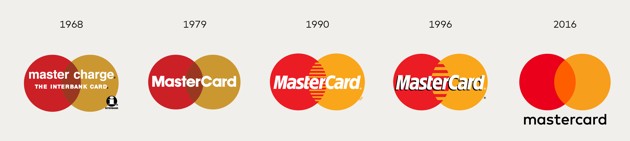
There are a number of good reasons to embrace “less is more” logo design. From a practical standpoint, cleaner and less-cluttered logos are more versatile and work much better on the myriad of platforms on which modern logos must perform. Logos are needed in smaller and smaller iterations, where the decrease in size must not impede the logo’s clarity or ability to represent the brand.
This is especially true when it comes to text – there is a reason why few app logos have any text – as the logo gets smaller, text can quickly turn into a jumbled blob that takes up space without providing real value.
Therefore, if you are a brand with a logo or a visual brand that has the equity to stand on its own and earns immediate recognition from consumers, the choice to “slim down” is a relatively easy one. Some of the biggest brands out there have gone this path – from the McDonald’s golden arches and Nike Swoosh to Starbucks and MasterCard with their own logos.
However, as a new or lesser-known brand, it would be advisable to proceed with caution in this aspect of brand development. It is logical that the removal of a brand name from a logo would decrease ease of recognition and connection between brand and logo, which is a step that is crucial in building a brand. Mattila deems the “debranding” strategy as one “based on paring down that can only be deployed by the most identifiable of brands.”
Additionally, Matilla explains that “Some marketers believe that debranding can make global brands appear ‘less corporate’ and ‘more personal to consumers.’” This personalized feel in corporations is a direct reflection of the way technology and new companies are headed. This is one way for larger, older brands to stay relevant and directly target younger generations with the goal of having them continue using products their grandparents and parents use.
Coca-Cola’s early success with debranding is one of the most prominent examples, namely the “Share a Coke” promotion, where the brand replaced the Coca-Cola name on its bottles for a massive variety of people’s first names, in addition to nicknames and monikers. The campaign was a massive hit with consumers, who sought out bottles which featured their names or the names of loved ones, and provided Coca-Cola with a personalized stamp on each of their products, by simply backing away from the branded aspect and replacing it with an element that connected deeper.
Going with a simpler visual brand and separating text from logos signifies confidence in brand familiarity and its consumers. Debranding takes this a step further by not only showing the consumer that you feel your logo has the equity to stand on its own, but also allowing for an expansion of personalized and authentic branding efforts, designed to strengthen the connection between consumer and brand.