“Back to the Future” Branding
Sometimes, the best way to move forward is to take a look back. To look back at the best of what you have been in order to ensure the best that you will be.
For brands, this rings especially true when working through a rebrand or a brand refresh. Especially when the brand you have is one of the few “iconic” brands on the market, coming with a built-in nostalgia and fond memories of the branding of yesteryear.
However, this version of going back to the future comes with no worries of messing with the space-time continuum – in fact, tapping into a brand’s past can have positive impacts on its future.![]()
For instance, the Philadelphia 76ers basketball team has a two-pronged historic foundation to which it can build its brand refresh. Not only are they one of the oldest and most successful franchises in the NBA, but their home city also doubles as the birthplace of America.
So for their new branding efforts, they tapped into these two reservoirs of history and came up with a new brand that touches on both – for instance, their new uniforms are reminiscent of the ones the team wore in the mid-1970s, while they introduced a “dribbling Ben Franklin” alternate logo to go along with new television ads referencing the American Revolution – which was also the original influence for the team’s name.
Evolving a brand with a nod to its history is a great way to connect with your entire consumer audience – not only will you reach those who are excited about the rebranding efforts and the new aspects that come from it, but you’ll also have the automatic tie-in with those who remember fondly the “golden years” of your brand.
From a design standpoint, tapping into a well-regarded and well-received visual branding element from your past also prevents the chances of over-thinking a new design, where in an effort to develop something new and revolutionary comes out as off-base and not in line with your brand strategy. For these longtime brands, there’s a chance that the best design path is right there in the archives, and with a little touch-up, you can put forth a brand strategy and design that is both modern and historical.
Miller Lite, who had seen recent sales slides and was losing competitive share to its rivals in the U.S., looked to its past for what was originally meant to be a temporary brand shakeup, but has 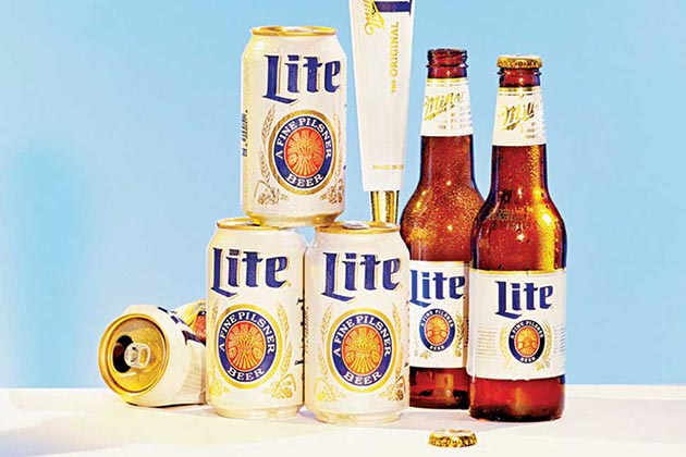 turned into a permanent new visual branding look. In conjunction with an advertising campaign centered around the release of the movie Anchorman 2 (set in the 1970s), the brand re-released its classic circa-1975 white Miller Lite can, complete with the retro logo design.
As for the result? Well, the numbers speak for themselves – the brand sold 32 million more cans during the campaign run compared to the same time the previous year, and has now expanded the nostalgic branding to its bottles and taps.
And don’t forget, just like every other aspect of branding, you have to follow the mantra of Tim McDermott, who is the 76ers CMO: “A brand isn’t just a TV spot. It is your soul, your DNA. It has to permeate through every fiber of the company.”
Image Sources:
http://espn.go.com/nba/story/_/id/12865822/sixers-score-ben-franklin-logo
http://www.bloomberg.com/bw/articles/2014-09-11/miller-lites-original-label-sales-boost
Addison Whitney is a global branding firm with a passion for building strong brands.
To learn more about Addison Whitney, visit our website at AddisonWhitney.com, or contact us here.