Brand Refreshment: Belk vs. Gap


………………………………………………………………………………………………………………………………………………….
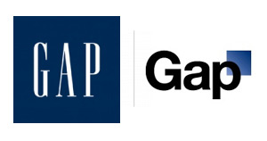
Much of October’s design buzz was focused on the new Gap logo. With the change came die-hard Gap customers commenting on blogs, Facebook sites, and within the design community.
Marka Hansen, president of Gap North America, initially defended the logo, writing that the move brings Gap into the modern age. “We want our customers to take notice of Gap and see what it stands for today,” she said. “We chose this design as it’s more contemporary and current. It honors our heritage through the blue box while still taking it forward.”
Hmm. The iconic blue box of Gap was actually diminished, rather than honored in the new design. Adding a gradient and moving it into a submission position does nothing in my mind to ‘honor its heritage.’ After only a week, Gap decided to revert back to the original logo.
Belk Department Store debuted its new image right around the same time, but was somewhat overshadowed in the media. Both Belk and Gap stated that they wanted to move their respective brands into a more updated space, and redesigned the logos to coincide with the modern feel of the apparel and the stores. So why was Belk’s change more widely accepted (individual design critiques aside), and Gap’s new image was met with such passionate disapproval?
A couple of ideas:
1. Regional awareness. Belk is a regional brand, with a smaller target audience than the global presence of Gap. While Belk isn’t just “your Grandmother’s store” anymore, the company hasn’t been as active over the years in building and defining their brand image, so their change could be met with less resistance.
2. Belk is a collection of individual brands. Gap IS a brand.
3. Lack of connection to the audience. Belk had a plan for change and is systematically making the change market by market, and Gap introduced the logo to the entire world without so much as a hint that something new was coming. For such a devout target audience and such a large presence, you have to be prepared for the response – positive or negative. No market research to find out what customers think prior to launch?
4. Redefining the brand … consistently. The Gap logo is/was classic. “Classic” is actually what their brand was all about. If they wanted to modernize or talk about their new modern jeans, they could update their collateral, or use social media in a new way to talk to their audience. Create a contest to have customers help design the new logo. The same can be argued about Belk: the iconic script was regarded as a logo with “class and character” that many argued should have been retained. However, Belk complemented their change with a tagline: “Modern. Southern. Style.” which helps to reinforce the overall change.
What are your thoughts on refreshing a brand? Total re-definition through a new name or logo? Change the tagline? Update your social media efforts? Any other positive examples?
I think the gap one was a major mistake overall. I won’t go into why, plenty of people have. The Belk one is interesting, and maybe not a great choice either–why’d they go with a retro-ish font? And modern. southern. style. hmmm. Retro font+modern? Southern?? Then pointing out style like it needs to be mentioned so it’s not overlooked. There is a better tagline out there. Their dollars would’ve been better spent investing in e-commerce rather than a logo-redo. Their website is far behind the times, and a technologically savvy update would serve them better than a new sign. Actions speak louder than words.
I agree wholeheartedly with your third point, Paula. Belk decided on a change, had a plan and began communicating about it. Before the new brand was launched, key customers were invited to a breakfast to learn more about all of the changes. No one likes change, but if a company communicates about why it’s making the change, it may just be surprised about how receptive customers can be.
I think a good example from an iconic brand is The Clorox Company’s new logo (see the site below). The new logo embodies products under The Clorox Company such as Green Works and Burt’s Bees.
http://www.environmentalleader.com/2010/09/30/new-clorox-corporate-logo-better-reflects-sustainability-focus/
to me, the new logo is tacky. i get what they are trying to do, though. they are going after a younger audience and trying to fit in with the new “hip” and “modern” society. i think the old logo was simply yet classy, while this one is simple and not well thought out. the curvier logo stood out from the rest, and attracted me to the store. this new logo just looks horrible and almost looks like a walmart logo (no offense to walmart, hehe). my main point here is that they should stick to tradition, like PEPSI should have.i always preferred pepsi, but i now drink coke because of the logo change. Belk, please change your logo. and this is coming from a 15 year old, that should say something. even my friends don’t like it…there goes your audience.
p.s.- one major part of logos and getting the consumer’s attention is memories. this may sound idiotic, but it is true. for example, many people buy coca cola only because of their memories they have as a child. they may like pepsi, but when the consumer sees that familiar logo with a certain memory, they go after it. this is the only belk logo i have known, and it is the only one i would go after. enough said.