Case Study Wednesday: Pilgrim’s
As one of the leading global branding firms, Addison Whitney is behind some of the world’s strongest and most iconic brands. We’re proud of the work we do for all of our clients and love sharing our stories.
That’s why we’ve launched “Case Study Wednesday”, where we highlight one of our amazing clients and the work we have done with them. To learn more about our work, click here.
This week, we will be featuring our work with the Pilgrim’s Pride Corporation:![]()
Pilgrim’s Pride Corporation is a Fortune 500 company and one of the largest chicken producers in the United States and Mexico. Even though the company has a long tradition of producing healthy, high-quality food products, there was a disconnect between the visual identity and the company’s goal to redefine its retail brand to be more consumer-focused.
Before work on the visual side could begin, our brand strategy team took the lead and initiated an external assessment of the Pilgrim’s Pride perceptions relative to competitors. We surveyed consumers to identify which factors were important to them when purchasing chicken and how well Pilgrim’s Pride delivered on those attributes. These findings drove the brand strategy and positioning development 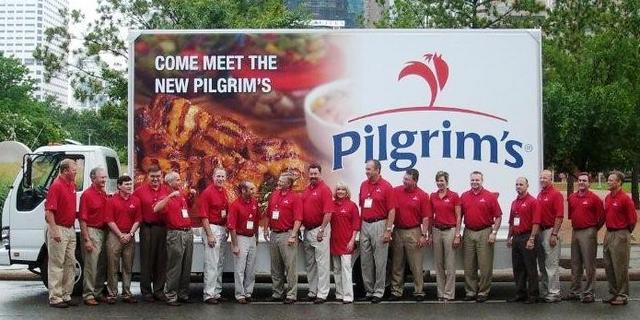 and laid the foundation for the visual components of the project.
The Pilgrim’s Pride brand received a complete visual overhaul that included: a new corporate logo, a logo exclusive to packaging applications, a new corporate stationary system, and an updated brand packaging design. To ensure the visual identity direction resonated with Pilgrim’s Pride’s target audiences, a validation study was done for both the logo and package designs following development.
Teams Involved:
Brand Strategy
Visual Branding
Follow us on Twitter @AddisonWhitney or join the conversation on Facebook and Google+