Iconic Logo Timeline Shows There’s No One Way to Evolve
Logo evolution is a natural part of the branding process. In fact, the evolution of the overall brand is common, and often necessary, in order to keep up with the latest advancements in the marketplace and ever-changing consumer mindset. But how a logo “should” evolve is still up for debate.
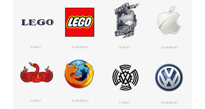
The below infographic by The Logo Company shows how a number of iconic brands have tweaked and shaped their logos over the years. And one thing is abundantly clear: the debate on whether there is a single definitive way to evolve a logo is over. The data overwhelmingly disputes the validity of one-size-fits-all logo evolution, driving home the point that each logo should keep the brand at top of mind and at the forefront of its evolution.
Dave Dixon, Senior Graphic Designer at Addison Whitney, sees a number of unique strategies within the logo evolution examples.
“A lot of these, like BMW, VW, and Shell, have really focused on using logo evolution to clean up and streamline their logos,” he says. “To me, that indicates strong brand equity and a logo that illustrates the importance of brand building over communicating something extremely specific. The Shell logo, for example, doesn’t tell you that it’s a fuel/energy company or anything else about the business. But it’s unique and recognizable, so it does a better job than most other logos.
“The YMCA logo is probably the best example of an organization that felt they needed a new direction. The current logo is pretty clearly more youthful, energetic, and fun than the previous versions. It seems more friendly and accessible, which is a departure from the earlier logos.”
He points out that the Windows logo is possibly the most interesting progression, mentioning how it has almost come full circle at this point – the current logo has far more in common with the original logo than with any of the iterations in between, speaking to the importance of simplicity and recognition over specificity and trendiness.
Full-circle logo design, new directions, specific communication vs. brand building efforts – the evolution of brands and logos has it all, and more. The one thing in common for them all is that they are all done within the premise of building a strong brand, and stressing the importance of continuity among the most recognizable brand elements. Whether it is a color scheme, a shape or a wordmark, a good logo evolution will build on the existing brand equity. Even if they all take use different blueprints in the building process.

