Long Term vs. Short Term Benefits of Rebranding
Today we are excited to have a guest blog from Senior Graphic Designer Dave Dixon!
Studies like Logos Now, which we highlighted on brand salsa last October, have repeatedly shown that the strongest, most recognized brands are those of companies like Apple, Nike, and Coca-Cola. But that doesn’t mean those companies, or any companies in general, have a monopoly on branding, particularly when it comes to visual branding.
In fact, one of the most widely seen – yet often unnoticed – forms of visual branding comes from the government, in the form of highway traffic signs. While the purposely bland, utilitarian nature of traffic signs may seem like a form of anti-branding, the typography they employ offers several useful parallels to the efforts of corporate brands.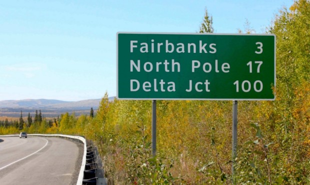
In 2004, the U.S. Federal Highways Administration (FHWA) approved the use of a new font for highway traffic signs. The font, called Clearview, was developed specifically to improve the legibility of highway signs. Tests showed that it was a success, with Clearview providing roughly 1.2 seconds of extra reading time over its typographic predecessor, Highway Gothic. However, on January 25, 2016, the FHWA announced that Clearview was no longer approved for use on American highways.
So after 12 years, why the change?
As it turns out, there are likely several factors at play, with the biggest being the fact that the FHWA never officially mandated the move from Highway Gothic to Clearview. Instead, they simply approved the new font for interim use, leaving it up to individual states to implement it (or not) as they saw fit.
One other factor that may have influenced the decision is cost. While Highway Gothic has been in use across the country for more than 60 years, state and local governments who adopt Clearview must purchase a font license, which can reach up to $795 for the full family of typefaces – for each individual user.
Unsurprisingly, implementation of the new font has been inconsistent. With no clear mandate and a financial obstacle in the way, only slightly more than half of U.S. states have adopted Clearview for their highways signs. Furthermore, inconsistencies remain even within individual states, as local governments have sometimes instituted the new font while the rest of the state officially
continues to use the old one.
It’s not difficult to see how consistency is an important characteristic for road signs. Regularly travelling at speeds as high as 70 or 80 miles per hour, drivers rely on being able to quickly and 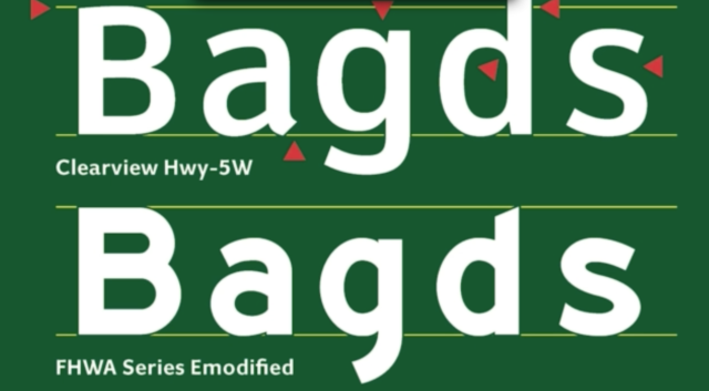 accurately gather information and make decisions. And while it may not be as readily apparent, this lesson applies equally to corporate branding. In a crowded marketplace, potential customers also rely on being able to easily find the information they need to make purchasing decisions. It becomes vital for companies to maintain a consistent look and feel not only for their typography, but also for their logo, color palette, and other visual signifiers that set their brand apart.
The FHWA’s decision also highlights another issue – the short-term vs. long-term benefits of rebranding. The cost for state and local governments to acquire Clearview may indeed be an immediate burden on already strained annual budgets. However, with the research indicating that the change provided drivers with valuable extra seconds, when does the benefit begin to outweigh that financial burden? A font license is, after all, a one-time cost.
In the same vein, corporate brand equity isn’t to be taken lightly or sacrificed on a whim. But if the current visual brand is holding a company back from reaching its full potential, introducing a new direction (and absorbing the initial financial cost that comes with it) may be well worth it. Regardless of the brand, consistency across the board is a vital component. Without it, much like the current state of highway signs, you may find yourself neither here nor there.
Image Sources:
http://www.citylab.com/commute/2016/01/official-united-states-highway-sign-font-clearview/427068/
http://qz.com/605695/font-designers-response-the-us-governments-has-decided-to-nix-clearview-from-all-highway-signs/
Addison Whitney is a global branding firm with a passion for building strong brands.
To learn more about Addison Whitney, visit our website at AddisonWhitney.com, or contact us here.