Oh The Places Your Logo Will Go: Unexpected Mediums that Must be Considered in Visual Branding
When working through the visual branding process, especially in logo design, there are a few obvious places the logo will need to be displayed, such as office signage, business cards and websites/social media platforms. But it’s not enough to simply perform in the usual logo locations – in today’s increasingly diverse mediums in which logos will be deployed, logos must perform as they are needed, no matter the new and unexpected places they might be found.
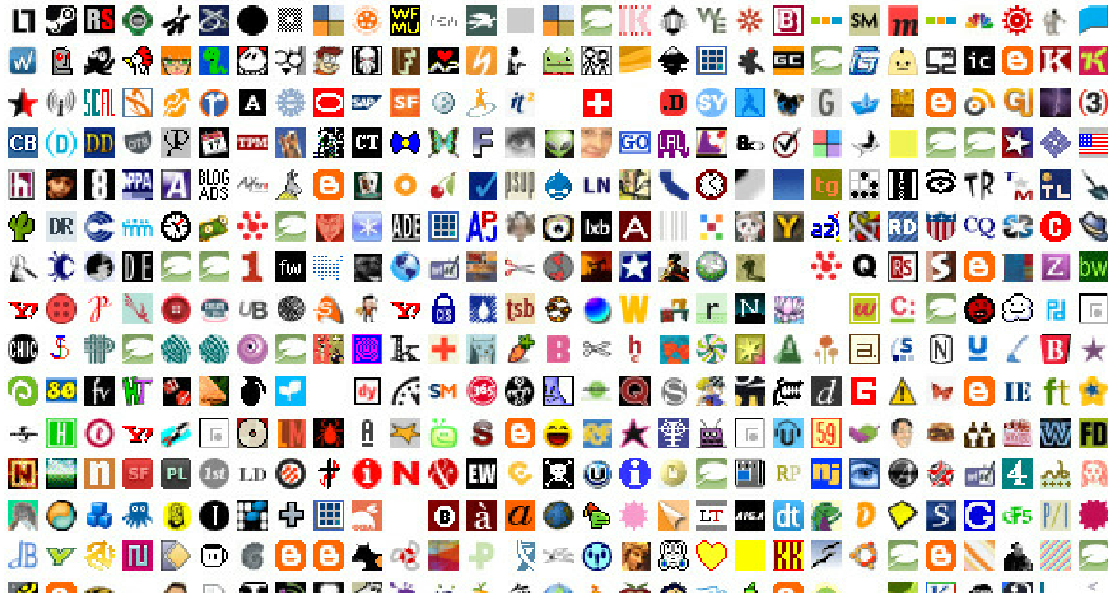
The impacts of this shift can be seen in recent design trends, including the rise of “modernized” logo designs, which de-emphasize intricate details in favor of simplified, smoother logos. These new looks carry a value in their ability to be easily replicated across various platforms and sizes. Other design trends, including wordless, icon-only logos and the development of animated versions of a logo, also carry a valuable nimbleness that translates across mediums.
 Those overseeing these visual brand developments should be wary of committing a total focus to these logo applications at the expense of the overall visual brand experience. It can be easy to slip into the opposite mindset, putting so much focus on ensuring the logo looks great when scaled down to a website icon-sized replica that when scaled up and applied to the usual areas, the overall look is compromised. It is a fine line between a logo that is solid on all ends of the size spectrum and a logo that excels in one but lacks in another.
This isn’t to say that the strategy should be one logo only, no changes, no variations, no matter what. In this case, consistency leans more along the lines of keeping key elements the same, but allowing for leeway in full usage or secondary marks. Many of the most successful visual brands have secondary or alternate logos, most of which are made specifically for a type of application. For instance, if a logo is mostly vertical but is going to be applied to a horizontal-focused medium, it would be time for a variation that still holds onto some essential brand elements but doesn’t compromise in quality.
More places to have a logo means more opportunities to get your brand in front of consumers to build brand equity. But if the consumer can’t easily connect the smaller or alternate logo back to your overall brand, you are missing out. As such, design with key brand elements in mind. Do you have a dominant color scheme, like the UPS brown, or a unique shape, like the
McDonald’s arches? Put these at the forefront of your design. That way, no matter what version, size or application a consumer sees your logo in, there will be an inherent ease in connecting it back to your overall brand.
A bonus piece of advice when working on this type of logo design – strong brands in general all possess these standout elements, so if you’re struggling to identify which should be the driver in your logo design, it may be time to go back and look at your brand development strategy.
Visual branding will be somewhat driven by the evolving and ever-advancing ways in which we consume our brands, and as such, the cornerstone of the visual brand development – the logo – will be will be required to follow suit. These strategies and best practices will help ensure that your logo works for your brand as well as possible, no matter what platform it is given.
Has your company recently experienced change or growth? Due to changes in business strategies, acquisitions, internal organizational changes or the addition of new products to a portfolio, your brand strategy may need to evolve over time. Click here to download your free copy of “Your Brand’s Guide to Corporate Change” today, and learn how to align your brand and business strategy for success!