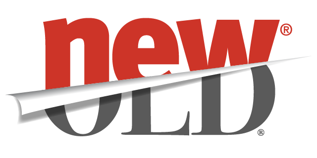
Brands with Long Histories Opt for Short Names
In recent years large and well-established brands that have long been able to rely on their long-standing history as the primary source of their brand equity have realized that, in a changing world, their past reputation may not be enough to propel them forward. In some cases, it is their impressive past which is the very thing holding them back. Companies which date back to the 1800s and early 1900s run the risk of seeming outdated and/or stuffy, especially among millennials.
Several large brands in industries as varied as banking, real estate, and even phone books, have made it their goal to change this perception through branding.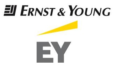
Ernst & Young, a financial institution which specializes in accounting, began in 1903. The name Ernst & Young probably brings to mind the phrase “Big Four Accounting Firms.” Thus, Ernst & Young’s 2013 rebrand accomplished the two-fold goal of both revitalizing an entrenched brand, while also redefining what their company can offer the customer beyond accounting services.
Ernst & Young rebranded themselves as EY, incorporated a new logo, website, and slogan -“Building a Better Working World,”- into their comprehensive rebranding strategy. Their previous logo and motto, “Quality in Everything We Do,” had been vague, reflecting the average consumer’s vague understanding of what exactly an accounting firm does. Now, with a yellow icon signifying upward progress and a motto that is a concise definition of their function, EY has positioned their brand better for the new generation.
Sometimes, the changes don’t have to involve an entire rebrand, but can include tweaks to the current branding elements that help bring the brand and company up to speed in the current market environment.
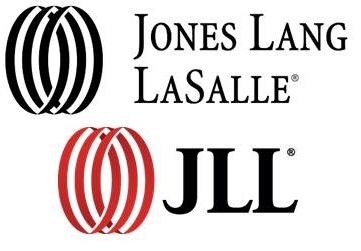 Jones Lang LaSalle is a great example of this “tweaking” strategy. Begun in 1773, this commercial real estate firm was struggling to adapt their brand to the increasingly international real estate market of today. However, in 2014 they rebranded as JLL. This rebrand was accompanied by the same icon as their original logo but with a change towards a new, brighter red. JLL announced that this new name was intended to increase pronunciation and recognition ease in international markets.
Both EY and JLL used visual and verbal branding changes to re-position their brand for the new generation, but, in some instances, companies may find it necessary to extend their rebrand even beyond those two categories and make larger brand strategy changes that physically change the way the company acts, not just how it looks or sounds.
Yellow Pages, a company which was born in 1886, and had used the “walking fingers” logo since 1962, was perhaps even more in need of a brand resuscitation than either EY or JLL; not only was The Yellow Pages brand perceived as antiquated but their entire business concept was quickly becoming obsolete.
Thus, rebranding Yellow Pages to YP involved not just creating a new name, but ensuring that the functioning of the company reflected the modern, convenient connotations of that 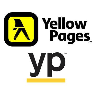 name. Yellow Pages thus focused on the creation of a new app with GPS features that allow easy access to Nearby Coupons, Popular Business Listing, and more. YP is no longer an unwieldy book of largely unhelpful information but, in fact, the complete opposite; YP is, as their slogan says, “the shortest path from to-do…to done.”
The demands of convenience, simplicity, and innovation are not new, but with each new generation, it is important for brands to reevaluate what those words mean to the consumer, because the definitions are ever-changing.
Addison Whitney is a global branding firm with a passion for building strong brands.
To learn more about Addison Whitney, visit our website at AddisonWhitney.com, or contact us here.