Why Your Brand Needs a Versatile Logo
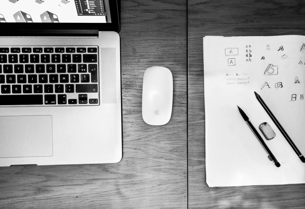
When working on a brand strategy to develop a new brand or refresh an old one is to create the crucial visual branding element – the logo. A brand’s logo is often its calling card, the first impression-maker with an audience and the centerpiece of its visual identity.
In today’s digitally-focused marketplace, a logo will live in and on more platforms that ever before. Logo designs that used to only need to look good on signage and business cards are now asked to translate into countless versions, including mobile websites, online ads, merchandise, etc.
“The more flexible a design is, the more places it can appear, the more people it can reach, and the more impact it has,” says Chris Cureton, Senior Graphic Designer at Addison Whitney.
Because of this, visual branding strategies have shifted to a place where logos must be adaptable to media and the placements to which it will live. As the visual representation of a brand, the logo has high standards for its appearance – the connection is inevitable of how the audience sees the quality of the logo and relates it to the quality of the brand.
Social Media and Digital Platforms are Major Factors
As has been discussed, social media has become one of the forefronts of any good brand strategy, especially in the development of a visual brand. This presents a unique case for designers, as they not only must accommodate the various sizes and shapes for the different social media platforms, but they also much take into consideration how the audience will be seeing the logo. Desktops, phones, tablets – these all present sizing and clarity issues unique to the others, but are necessary for a design to flawlessly adapt to.
“It doesn’t matter if it’s on the big screen or on your watch, we want the brand to present a consistent experience,” says Cureton. Consistency is a key factor in building a strong brand, but also one that can be reconfigured in a way when it comes to visual branding and logo design. This is where the rise of secondary logos and partial marks come into play. If a logo just doesn’t look right on an application or medium, the designers must also keep in mind that possibility of using a logo variation, one that still captures the essential brand characteristics but gives a different perspective.
Big or Small, It Still Needs to Work
Not only does a logo need to be visually appealing in different variations, but it needs to look just as good whether it is on a watch face on the side of a billboard. Versatile logos just don’t transfer well, but they scale well – big or small, the meaning and visual impact is not lost on these designs.
This has been one of the forces behind the trend to more simplistic logo designs and away from the heavy detail of previous logos. Simple design factors are easily scaled up or down and provide the consistent look that is desired by brands. In another nod to the strength a digitally-focused society, many of these smaller renditions are required due to the ever-shrinking size of the screens we use.
Don’t Forget the Basics
An interesting aspect of this need for versatility is with all of the changes, the basic rules of good design have largely remained the same. Trends come and go, and tastes vary, but a quality logo design destined to have a long shelf life will carry many of the same elements today as it would 20 years ago. What has changed is the world around it.
“In a digital world, design must follow stoic principles. Control what you can control, and let go of what you can’t,” Cureton summarizes. “There are so many variables to think about; you can’t control it all. We have been forced to see that a strong logo design is also a flexible one.”
Addison Whitney is a global branding firm with a passion for building strong brands.
To learn more about Addison Whitney, visit our website at AddisonWhitney.com, or contact us here.