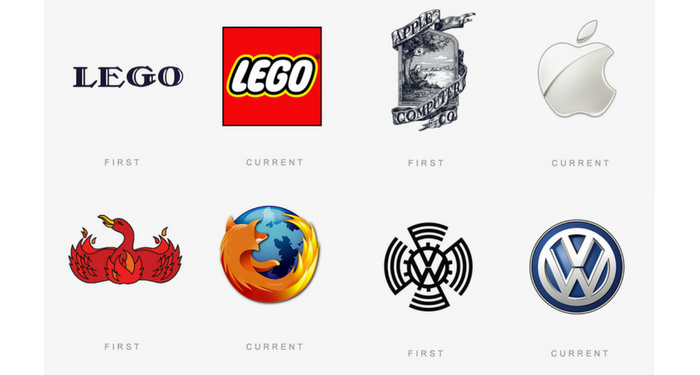
Logo evolution is a natural part of the branding process. In fact, the evolution of the overall brand is common, and often necessary, in order to keep up with the latest advancements in the marketplace and ever-changing consumer mindset. But how a logo “should” evolve is still up for debate.
Continue Reading
AW in Review – Addison Whitney Brand Salsa Recap 9.23.16
September 23, 2016
Miss any of our great brand salsa blogs lately? Not to worry – welcome to our initial September edition of the AW in Review, our roundup of our latest brand salsa and Addison Whitney news and posts!
Continue Reading
Function or Feeling – How Will You Position Your Brand?
September 22, 2016
Successful brands have purpose. They have pre-determined areas of differentiation and a target audience. They have a brand position. With this sense of direction, they can focus their branding efforts in the same direction, allowing for the full effectiveness to shine through. When creating your positioning strategy, there are two main aspects to use as starting points – function or feeling. But which one’s right for your brand?
Continue Reading
Brand Loyalty – How Easy is it to Achieve?
We all value loyalty – it’s one of the main reasons people get dogs as pets. It’s also why brand loyalty is such a prized accomplishment when brand building. Fear not, brand creators. Achieving brand loyalty can be done. The first step is to believe that it can be done, and be done with the brand you will have – take the aforementioned reasons for dismissing and take them out of the equation.
Continue Reading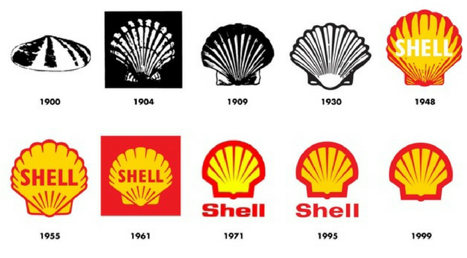
When Less is More in Logo Design and Visual Branding
September 14, 2016
As brands and logos have evolved over the last several years, it’s become evident that simplicity and minimalistic design is a key new direction for modern brand marketing. Even the most iconic brands and logos are following the mindset of “less is more” when it comes to their designs. From less detailed images to geometrically-inspired outlines, brands are embracing a clutter less existence.
Continue ReadingAW in Review – Addison Whitney Brand Salsa Recap 9.9.16
September 09, 2016
Miss any of our great brand salsa blogs lately? Not to worry – welcome to our initial September edition of the AW in Review, our roundup of our latest brand salsa and Addison Whitney news and posts!
Continue ReadingWhen Unifying Brands, Simplicity and Consistency are Key
September 01, 2016
FedEx recently announced that they would be doing away with its sub-brands (and all the fun color combinations) and moving towards one unified FedEx brand and logo. Unsurprisingly, they’ve opted for the purple and orange mark, which matches the company’s original color scheme and which internal research showed to be the most widely recognized among consumers. So what does this mean for branding in general?
Continue Reading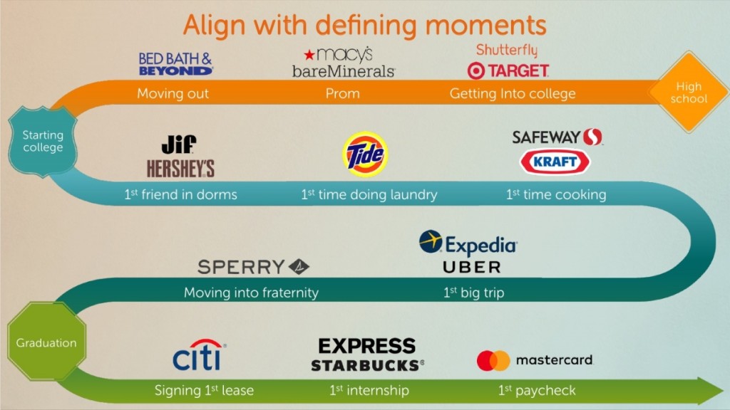
How to Attach Your Brand to Moments in Consumers’ Lives
The first goal of successful moment branding is to establish the brand connection. Make your brand THE first thought of an individual in the moment, surpassing the general, task-focused mindset that naturally exists.
Continue Reading
Patience is a (Branding) Virtue
Simply put, brand development is a practice in patience and the ability to stay the course. When creating a brand, especially during the strategic development phase, the end goal may seem a million miles away. Along those lines, there may be some bumps in the road on the way to success, which will undoubtedly cause some to begin wondering if and when the strategy should be abandoned.
Continue Reading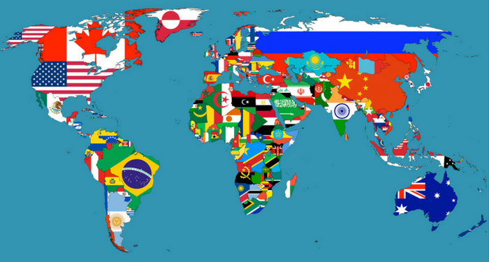
AW Spotlight – Visual Branding Team’s Favorite National Flags
August 11, 2016
During the Opening Ceremonies of the 2016 Olympics, each nation represented in the Games matched into the stadium behind their flag, giving viewers a firsthand look at the amazing visual branding exhibited by the flags, many of which may have been previously unknown. In this spirit, we asked two of our talented of the AW Visual Branding team members to give their selections of which world flags they felt are the most visually appealing. Let’s find out their selections:
Continue Reading